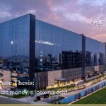
Light & Orientation
Place work with the sun, not against it. Reserve glare-prone perimeters for circulation or collaboration that tolerates variability; let focus bands sit where light is stable. Daylight routes—glass near corridors, borrowed light through interior glazing—help deep plans feel readable without over-lighting. There is growing evidence that access to daylight correlates with better sleep and well-being for office workers—outcomes that compound into steadier performance.
Acoustic strategy
Noise is expensive when it leaks. Prioritise separation between quiet bands and collaboration rings; think door hardware (not just partitions), ceiling/wall absorption, and where equipment hum lives. The most common complaint in open settings remains speech privacy and noise; it isn’t a matter of taste but of cognition. Designing for different minds, here, is designing for the human brain’s limits.
Core & circulation
The location of lifts, stairs, and services shapes how the day feels. A lift strategy that reduces clustering at arrival and lunch, stairs that people want to take, corridors sized for two people to pass without choreography—these are not cosmetics. They are the difference between a workplace that keeps time and one that steals it.
Wayfinding
Good wayfinding lowers cognitive load. Legible lobbies, sightlines that reveal the next decision, and consistent signage reduce the “Where am I?” tax you otherwise pay for every visitor, vendor, and new hire. The best systems combine the architecture (what you see), the plan (where you naturally go), and concise visual cues (what confirms you’re right).
Materials & finishes
Finishes should be chosen for both feel and function: touchpoints that age well; floors that carry movement without broadcasting it; wall/ceiling systems that absorb rather than amplify. The question is simple: does this surface support the task intended here in five years as well as today?
Tech that disappears
Comfort controls, access systems, and room-booking should be reliably boring. When technology is visible, it should inform, not demand attention. The goal is not to showcase features; it’s to ensure people don’t talk about the building because nothing is in their way.
Energy & well-being
Make movement close by (inviting stairs, short walks to daylight), provide water and nourishment where people already pass, and plan micro-retreats in underused corners. These are small design acts that produce large behavioural dividends.